Sunday, November 25, 2012

Colligraph Project


The other two projects in print making class did not bring me as much satisfaction as this one.  I am a former farm wife, which can be a detriment in the process of creating something that needs fine tuning.  I tend to work fast and hard to get the job done.  Such as with picking fruit or a canning project.  I think this could have come out better had I been more careful and thoughtful about the outcomes.  If I had tweaked them, I might have had a whole set of really nice prints.  But, all in all, I am the happiest with this project.  I did get five final acceptable prints and three good artist proofs. 

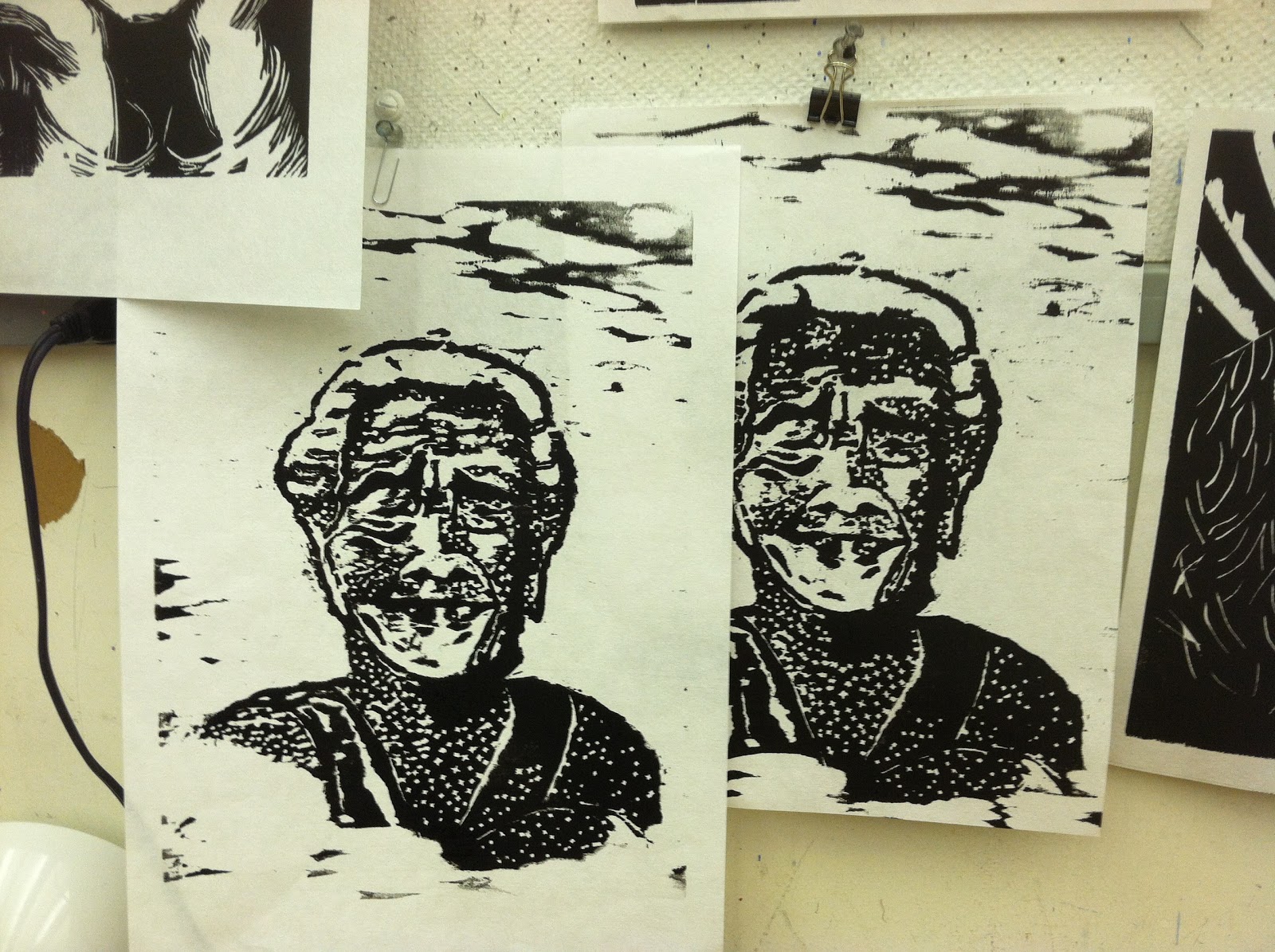
The process begins with a photograph which is scanned into the computer and printed out on regular paper.  We took a piece of mat board and painted it with Wintergreen oil, and inverted the paper onto it.  The winter green oil takes the ink off the paper and transfers it onto the mat board.  We then took our razor knife and cut out the darker areas.  We also built up lighter areas with paper cut to fit.  I added sand to glue for the leaves.  I used oregano  for the foreground texture.  I later used a puddy type product on the second run.  The first set of prints had a sink hole form appear in the lake.  I glued string for branches.  After we finished adding the textures or subtracting paper layers we coated it with elmers glue mixed with medium and then sprayed it with a majic gloss finish.


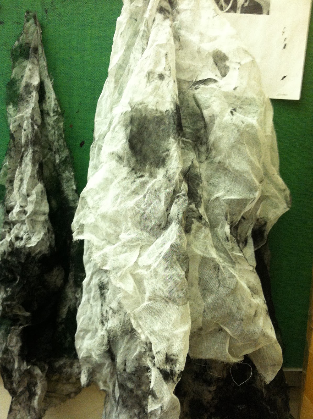
Calcium carbonate is added to the ink to make it thicker and stickier. The ink is mixed with the calcium and then applied to the plate.  Next we wipe it off.  Sadly, I have a photo of the tarlatan below.  The tarlatans are stiff cheesecloth which are used to remove excess ink. Prior to printing after you have removed the right amount of ink, we were taught to do a "palm wipe" with the edge of our hand.  This is to remove any lines that the tarlitan might have created.  We used Reives bfk paper, which is not cheap!  We needed five final prints.  The paper is soaked and blotted.  We created a newsprint  template to set the plate on so that the print came out centered on the paper.  We ran it through the press.


The plate became totally black, with applied ink.  See the sink hole below(on a final print)?!


Minus the sink hole with texture added on the bottom.  I think that I applied to much ink on the lower right corner. The above photo is not straight in front of the camera.  The subject is Kershaw Park.

Ceramics 1-Progressing Nicely--Coil and Slab

These are the "coil method" projects(two-fold).  One was to have the coil shape as part of the design, which is below(the bread basket).  The other was supposed to demonstrate the joining of the coils, with the coil shape not as obvious(ship/bowls).  These coil viking ships have been fired and  glazed, since this photo, - but not  fired a second time, to my knowledge

  I drew a sketch of what I wanted to do prior to commencing the project.  The little pot did not resemble the sketch enough so I started again.  I went back and completed the first attempt. This  second completed project was not for a grade.

 This picture shows the pots prior to their first firing. (Leather hard, approaching greenware)  The pot on the left is for the assigment.  There is a sail motif on the other side of the ship/pot.


This, above, was trashed.

To be sure that drying is slow, we add plastic to thinner areas, to keep in moisture.


I painted this with slip, to many of the areas where the sections join together.
This is my bread basket.  This is also prior to the first firing. (greenware stage)  When this was created, the top of a kettle was uses as a form.  My first attempt was trashed as I forgot to line the inverted lid with plastic, to facilitate removal of the piece!

 All three pieces survived and progressed to being bisque ware.  I offered my retired father the chance to choose the color of the basket.  Glaze was applied prior to Thanksgiving vacation.  It should be reddish orange when I check it out tomorrow--Unless, of course, there was no firing.


Our next project is also two fold.  We are using the slab method.  One is soft slab, which I do not have a picture of.  I draped a soft slab over 3 spheres, a tennis ball, a super ball and another middlesize ball.  After it firmed up I attached tiny ball and worm shape figures on it. It resembles an enlarged bacteria.  I am excited to see how it will come out.  I will have fun picking out colors.  Above is the hard slab method.  It is an impression of the front of my hous.  It is not an exact replica, but it is close.  


Friday, November 23, 2012

The Self Portrait In Oil

 This is the professor's example of her "self".  This was a demo of a "couch" procedure.


People told me this was not that good--charcoal on canvas preliminary drawing.


Nobody liked this one either- This is an imprimatura- as I did not understand the "couch" procedure.


This is the second attempt at the charcoal preliminary drawing, which is sprayed with fixative, prior to the green earth painting.


My attempt at a couch.


Coming along..many say it is not really a good likeness.  We are still using a limited palate.  Five additional colors, to the four we had for the last project.


I will finish the clothing, and take away the top of the eyebrows and possibly darken the white of the left eye.


My instructor helped change the complexion to be less like a zombie and I was also told to warm up my hair and soften the edges of my bangs.  I changed the background color.  Finished!!!


Sunday, October 21, 2012

Figure Drawing 1--the Gesture Drawing

I was going to add to the previous blog entry to expand upon "the gesture drawing" but instead I thought I would just give the topic its own space.

Our gesture drawings are timed.  We have a live model.  The teacher has a timer. 20 seconds or 30 seconds are about the length of the poses.  The model changes to a new position when the timer goes off.  I use vine charcoal on newsprint.  We do this for about a half hour, then we start doing longer poses.

Some of my drawings have the length of time, written on them, but they all should.  A gesture drawing is a loose capturing of the moment of the figure.  Details are omitted, as there is not the time.

No outline is allowed- one has to sort of scribble out a person onto the paper really fast.


I am not impressed with the ones directly below- too stiff


These are a little nicer- more movement is apparent. these are probably 30 seconds.


This might have been a ten second:


I like these below, but a little too outliney!


This one, in my estimation is a good one.


five minute--is below


Figure Drawing 1

In figure drawing we have a weekly assignment to draw a region of the body.  We also do gesture drawings observing from a live model. I have no photos of my gesture drawings- but will add later. Actually check the next blog.  I will share some of the latest work.


I was very fortunate to have a good angle for this pose! This one is not complete..we will work on it this week.


 This is a copy of a master- Michelangelo:


We were allowed to add a background.  I realized after that the mountain was placed wrong (the Matterhorn, so I "moved the mountain!"


My professor liked the background.  She thought that his lower legs and head are a little out of proportion.  So I got a 91 %..which is still good..probably will fix it.


She suggested darkened backgrounds--This is about the arm bones...


I really like this one!


Printmaking 1- the Monotype

With the wood block project, much effort was spent on getting the block right in order to produce many copies of it.  With the monotype, one only gets a single copy of the finished product.  It can be frustrating to spend a lot of time on an image painted on plexiglass only to have it come out sub-standard. One only gets one shot at a monotype!  I was experiencing such disappointment, so I changed my strategy.  The last time I went in to work, (Friday) I quickly painted up a bunch of botanical renderings. This first photo- I used up some paint--in an abstract expression of color:


These are the flower paintings- I was inspired by a wild flower handbook.


This is the Rieves paper soaking- It costs around 6 dollars for a big sheet.  The sheet of paper must be cut up on the paper cutter--and that is challenging in itself. When ones brain is focused on creativity, switching to the analytical- mathmatical side of the brain is not always that easy! The paper must soak a minimum of 15 minutes.  After it soaks it must be blotted to remove the excess water.


This is the above blue flower picture while I was creating it.  The Linseed oil thins the paint.  The white paint is a little thick at times.


Sorry that this is not the correct orientation--These girls are drawn from a reference photo.  My mother is in the center, as a child.  This print, has a border, which is accomplished by cutting a newsprint mat, which is placed around the image- prior to printing.


These below, are my first attempts.
We have the choice of oil paint or monotype ink.


The final submission for grading is between 5 and 25 prints.  The above chipmunk photo was taken by my former boyfriend and I took the photo of my grand-daughter.


Print Making 1- The woodblock experience

Printmaking starts at 11 on Tuesdays and Thursdays after Tai chi.  Tai Chi is extremely exhausting.  So when I get to printmaking, I am ready for a nap.  I am certainly not ready for frustration.  Our first project was the woodblock print.  We were instructed to find a picture of an elderly person and we drew from the reference photo.  Next the drawing was transferred to the block using winter green oil.  The step to follow was the carving of the image.  After that we did "working proofs".  We tweaked the image with our carving tools and proceeded to make "artist's proofs".

I chose an image of an elderly third world woman.  This photo is right before I started carving out her features- I had just removed the background.


This is my first artist proof- I thought I needed to fix and improve her.


The second run of prints on the fixed and improved image was not improved at all in actuality.  I applied the ink to thickly and she actually lost definition. Below the fixed and improved is on the left side of your screen.


This was the set of fixed and improved(not), just after printing.  

 Other people's work:

 This is where you scrape out some ink.  The clean- up is a lot of work..right here I am beginning to clean up.  When you role the tool in the ink it is supposed to make a certain squishy sticky sound.  You can tell by the sound if you have too much ink on it.  We cleaned everything with a soy-based oil cleaner.  We also rolled the roller on an old phone book.  The palette on the right is filled up with waste ink.


This is the press.  It is important not to leave the bed centered under the press part or it will make dents in the wood supports.  If there are dents in the wood supports it will cause the  print to not be even.  We worked with rice paper for this project. We also used newsprint over the top of the print during the printing part.


I said while I was working on her, "If I get an 80 on this I will be happy" .  Grades are not my main motivator, but....anyway- my professor gave me an 82.  I thought that was good, especially since the class average was in the seventies.  We submitted 5 final prints and two artist's proofs.  I ran a whole extra printing, which was unnecessary.